Atelier100 Showroom, Mare street
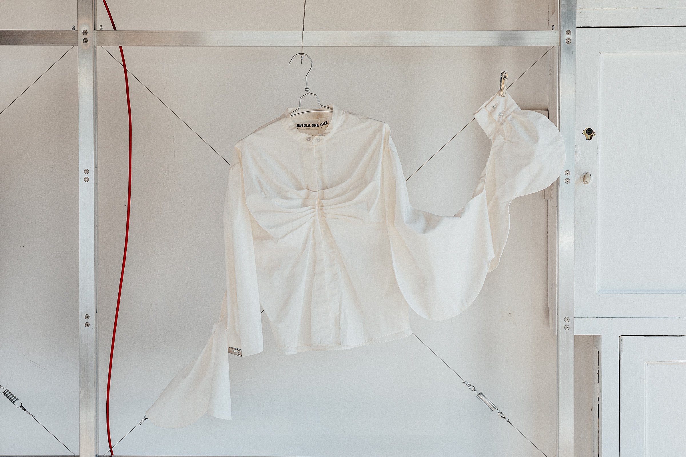
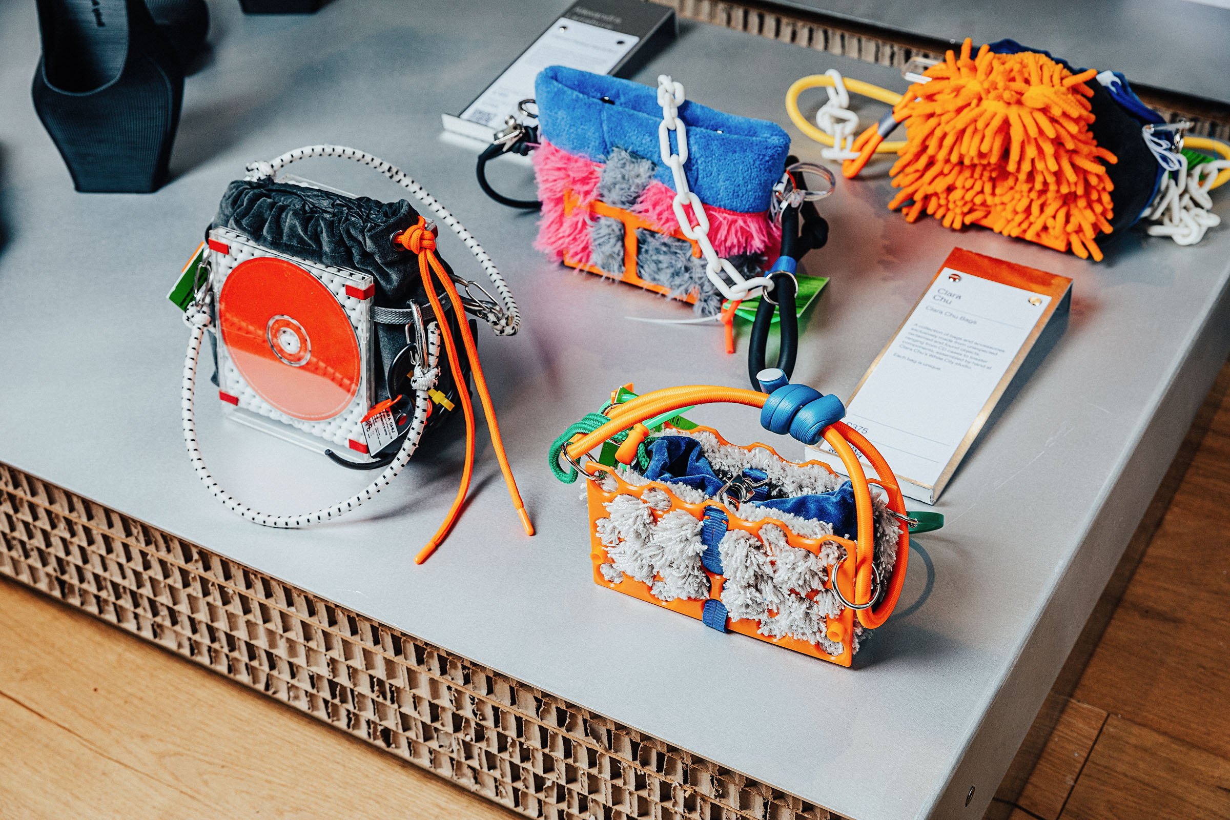
The first of three new showroom spaces for Atelier100. We were commissioned by the local design initiative (who supported us last year in their inaugural programme) to design a series of adaptable units to house the second collection from 22 designers, ranging from fashion to homeware. The concept we developed for the spatial design is a reimagining of traditional London market stalls, capturing some of the energy and quick thinking you find in those spaces. Considering London’s rich history of making and selling, we were aesthetically inspired by the awnings and structures found in these market stalls that have lined the city’s streets for hundreds of years. We echoed these shapes in a series of adaptable, modular units where the collection pieces can hang, sit and stand at various heights.


There were a few design decisions that guided the concept. First was finding a genuinely new and innovative way of democratically displaying objects and pieces; this meant playing with form, height and surface configuration to accommodate the variety of pieces, from clothes which needed to be hung to stools that needed to sit at lower levels. The next was to use a largely mono-material palette that supported the brief of making a largely adaptable structure that could be disassembled, moved, stored and then reassembled in other spaces. We used a combination of aluminium and heavy-duty honey-combed cardboard, both lightweight and endlessly recyclable materials, joined using impermanent material connections like bolting, tensioning and cradling.

Echoing the community spirit of Atelier100’s programme, we wanted the space to be not only a place to sell and pre-order, but also somewhere to gather and explore. Taking advantage of 3 Mare Street’s unusual layout, we created a corner space where a large screen showing behind-the-scenes footage of the makers in their workshops stood next to a reimagined till – one which dropped down into a bench for staff or visitors to sit on. This idea spilled outside, with two aluminium benches flanking the doorway. Similar to the laser-cut A-board (featuring the names of each designer on one side, the other side’s negative space showing where the swing tags had been removed), these benches were weighed down by rocks, a material totem of Mitre & Mondays’ design language.
We collaborated with cause-led branding and communications agency, Templo, on the point of sale elements that guided visitors to learn more about Atelier100, the designers and the collection. Visual merchandising was also a key element to integrate into our spatial design, working closely with the Atelier100 retail team on how objects sat and pieces hung on the structure.
All image credits: Taran Wilkhu for Atelier100


